Jay / worked with / Gjøl Kro
UX case study
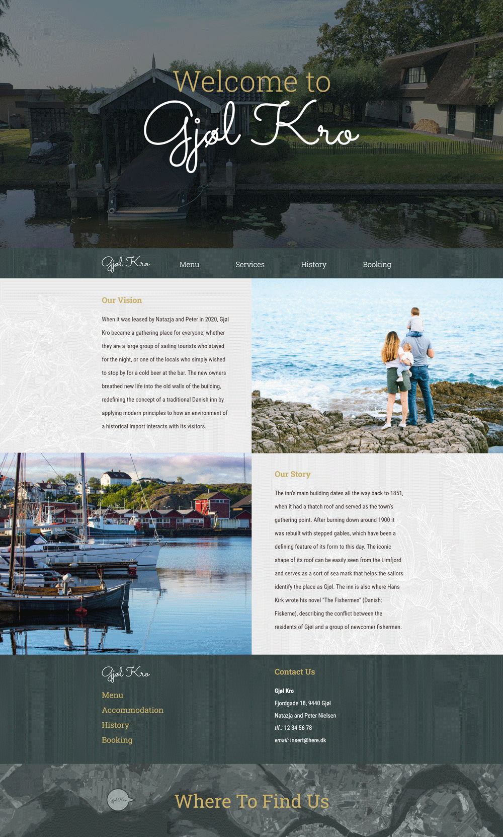
During this case, I worked with Gjøl Kro, a traditional Danish inn. The client expressed their wishes to
create a website that would convey their modern approach to Danish cuisine, while still maintaining the
historical atmosphere of their locale.
The goal of this project was to create a responsive website that could serve as a source of
information for potential clients, while also providing insight into the experience through its
content.
Though I was involved throughout the whole process of development, I was mostly
responsible for creating and realizing the design of the website.
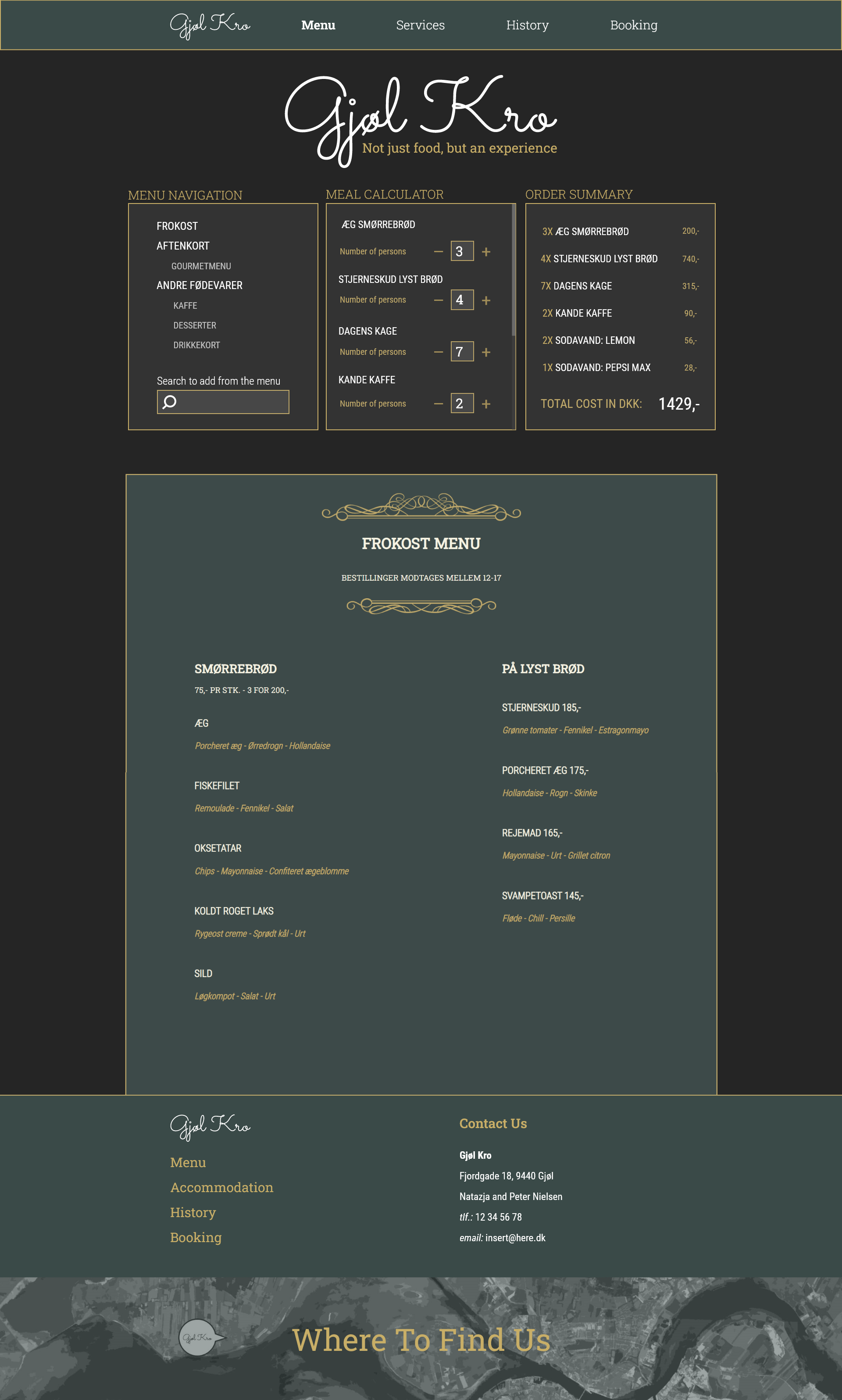
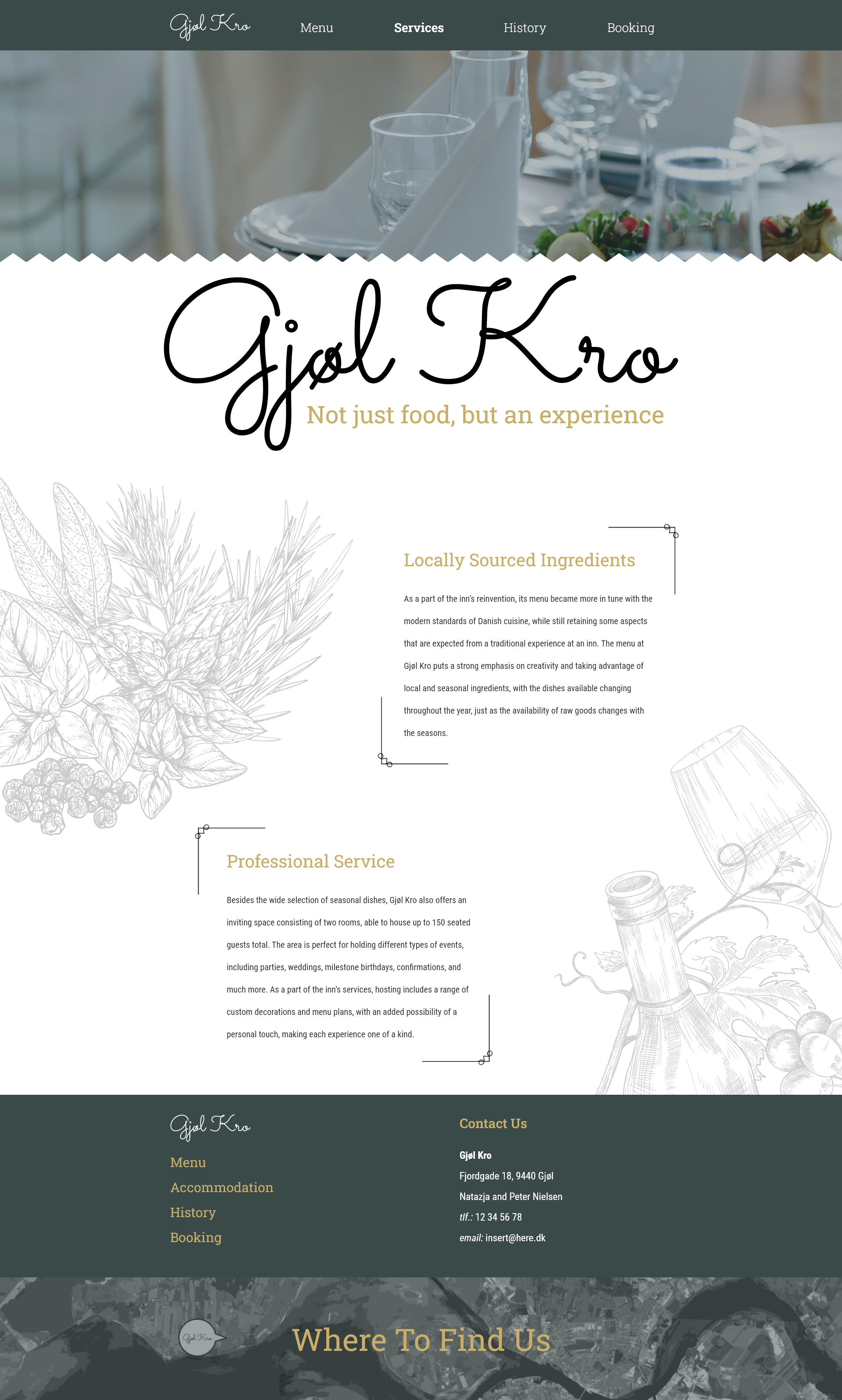
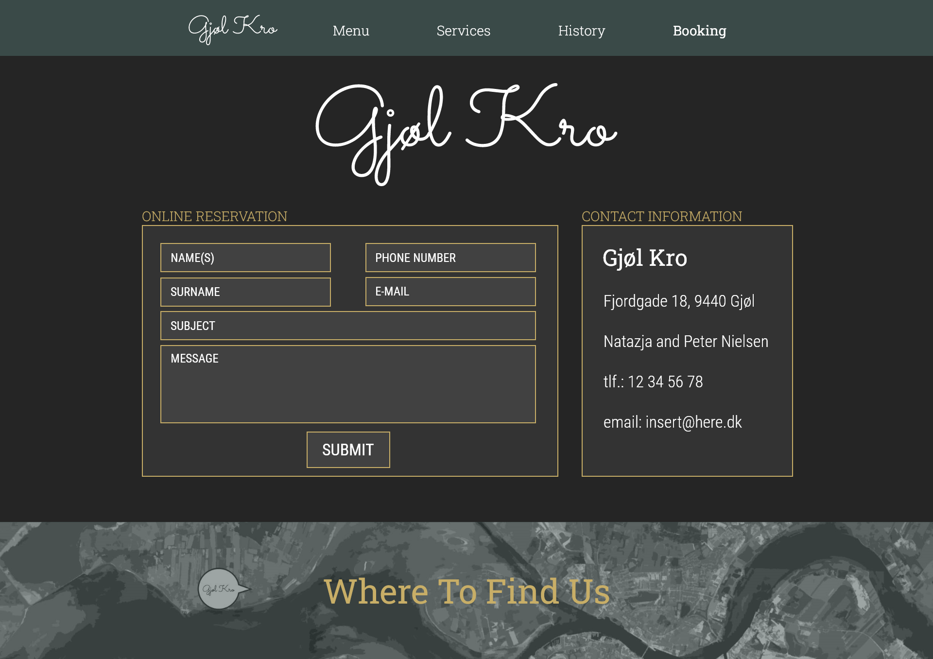
You can see the preview of the final product
Process summary
- Participated in multiple workshops brainstorming possible design solutions.
- Researched similar products to analyze best practices.
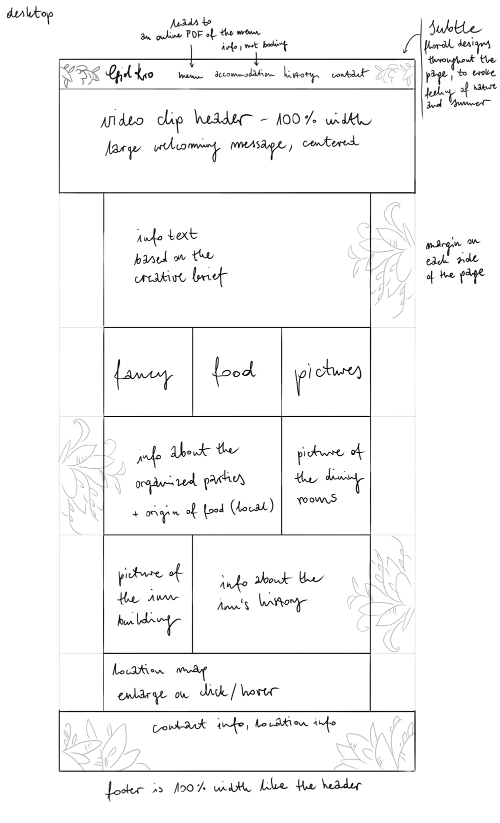
- Created a low-fidelity wireframe based on initial research.
- Developed a high-fidelity mock-up in Adobe Xd.
- Conducted tests on the mobile version of the product with external users.
- Developed a high-fidelity prototype in Adobe Xd based on feedback.
- Coded elements of the website's interface using HTML, CSS and jQuery.
- Ran Think Aloud tests on the first iteration of the website.
- Adjusted the final product in accordance with user testing.